Naho Manufactura Creativa
Brand Identity Development Case
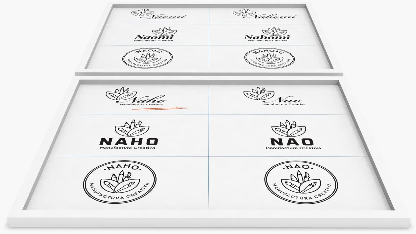
This project encompassed the complete creation of a brand from the ground up, including the development of the brand name, graphic identity, and various adaptations.
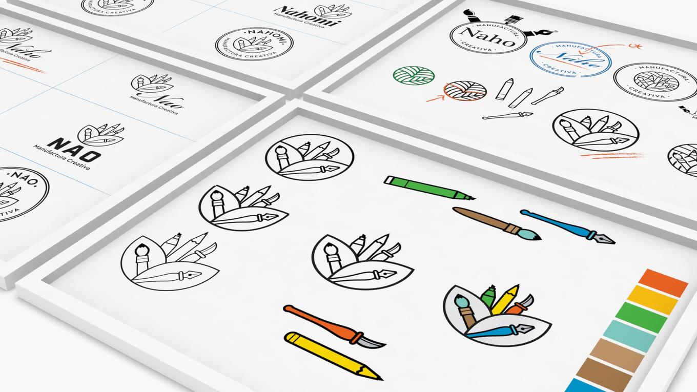
Our logo for Naho Manufactura Creativa beautifully captures the essence of a creative studio dedicated to producing handcrafted wooden pieces. The design incorporates vibrant colors and dynamic elements that symbolize the diverse range of tools and skills utilized in the studio's creative processes.
At the heart of the logo is a stylized representation of various creative tools, including a paintbrush, pencil, sculpting tool, and fountain pen, all neatly arranged within an abstract leaf shape. This composition signifies the studio's commitment to blending different forms of artistry, from painting and drawing to sculpting and writing, highlighting the versatility and comprehensive nature of their craftsmanship.
The color palette features bold and lively shades: green for creativity and growth, yellow for energy and optimism, orange for enthusiasm and warmth, and blue for depth and reliability. These colors collectively emphasize the studio's vibrant and dynamic approach to manufacturing creative and high-quality handcrafted items.
The studio’s name, "Naho," is elegantly displayed in a sophisticated script font that exudes creativity and flair. This choice of typography reflects the studio's dedication to artistic excellence and precision. Below the name, "Manufactura Creativa" is presented in a clean, modern sans-serif font, reinforcing the studio's contemporary approach to traditional craftsmanship.


