Hogart
Brand Identity Development Case
This project involved creating a brand from the ground up, including the brand name, graphic identity, and all necessary adaptations.

Our logo for Hogart captures the essence of a leading modular construction company with a modern yet sober design. The logo features a unique bicubic shape, symbolizing innovation and structural integrity—key aspects of modular construction. The color palette combines a vibrant yellow with earthy brown tones, representing energy, reliability, and a strong foundation.
The yellow signifies the innovative spirit and forward-thinking approach of Hogart, while the brownish hues convey trust and dependability. The logo’s clean lines and geometric form reflect the precision and efficiency inherent in modular construction, making it instantly recognizable and memorable.
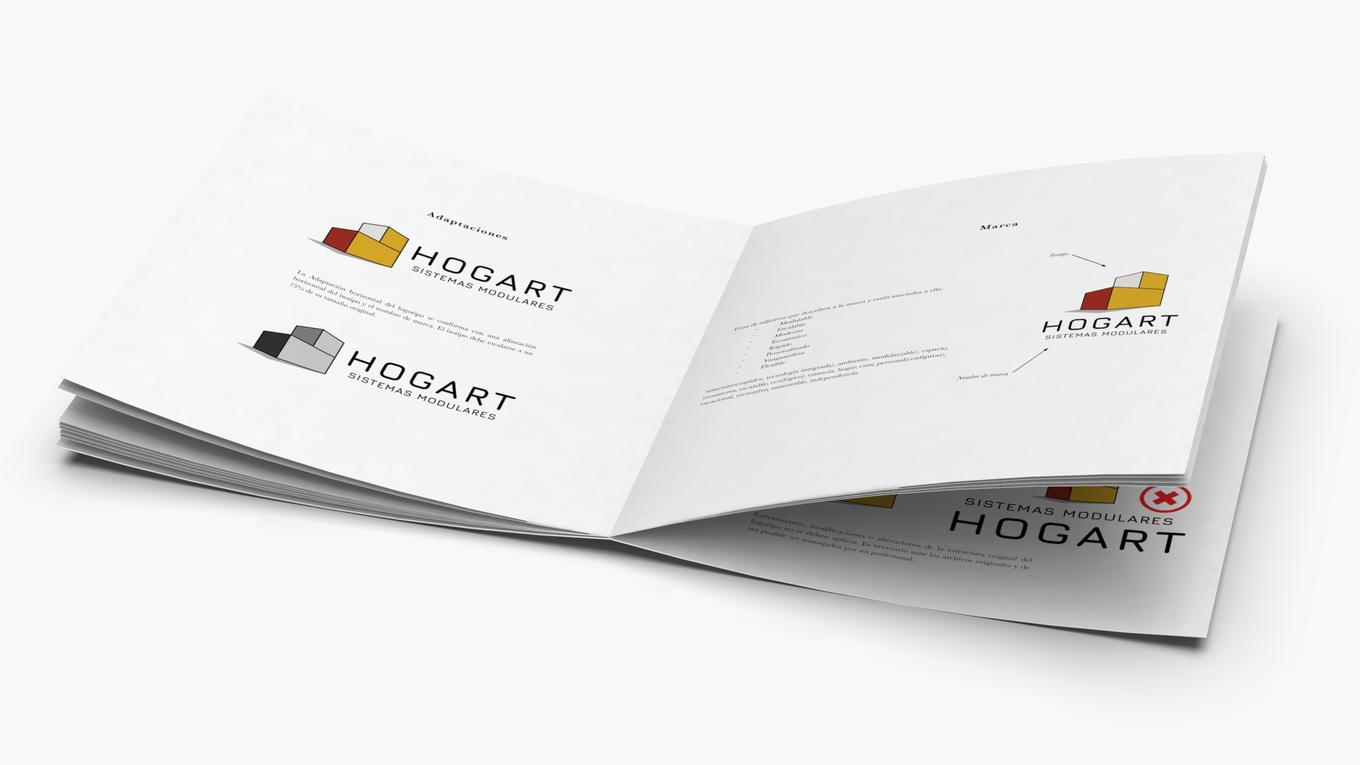
As every client who trust on our services, we deliver a complete Brand Development Guide together with the logotype.
The brand development guide for Hogart is a vital tool that ensures the company’s image remains consistent and professional across all platforms. This guide lays out clear instructions for the correct use of the logo, color schemes, and typography, making it easy for everyone involved to maintain a cohesive brand identity.
By following this guide, Hogart can effectively communicate its values of innovation, reliability, and quality, helping to build trust and recognition with clients and partners alike. This document is your go-to resource for creating marketing materials that truly reflect the spirit and excellence of Hogart.


