Forseti Law Firm
Brand Identity Development Case

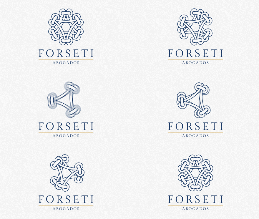
Our logo for Forseti Abogados encapsulates the essence of a prestigious law firm through a refined and sophisticated design. The logo features an intricate knot pattern forming a central triangular shape, symbolizing strength, unity, and interconnectedness—key qualities in the legal profession. This emblematic design highlights the firm’s dedication to providing cohesive and reliable legal services.
The color palette is a deep, authoritative blue, representing trust, professionalism, and stability. The use of this color underscores the firm’s commitment to delivering dependable and high-quality legal counsel. Complementing the blue, a subtle gold line under the firm’s name adds a touch of elegance and prestige, emphasizing the firm’s distinguished reputation.
The typography is split into two parts. The name “FORSETI” is presented in a classic, serif font with clean, bold lines, exuding confidence and tradition. Below it, “Abogados” (Lawyers) is written in a more understated, sans-serif font, maintaining a modern and approachable feel. This combination of fonts effectively balances the traditional values of the legal profession with a modern, forward-thinking approach.
This logo not only serves as a visual identifier for Forseti Abogados but also communicates the firm’s core values of integrity, expertise, and reliability. It is designed to attract clients who seek professional and trustworthy legal services, reinforcing Forseti Abogados’ commitment to excellence in the legal field.


