Adopth an Oleh
Brand Identity Development Case

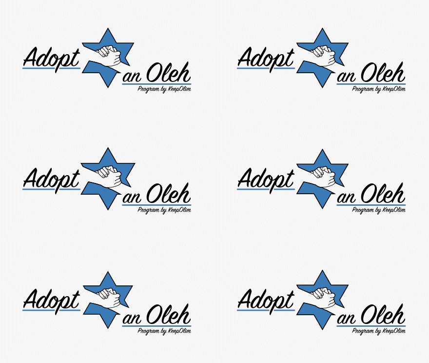
The journey of crafting the logotype for ‘Adopth an Oleh’ was an inspiring fusion of symbolism and purpose-driven design. Rooted in the essence of aiding new immigrants in Israel, every element was meticulously chosen to resonate with the organization’s mission.
First and foremost, the isotype embodies the heart of ‘Adopth an Oleh’. The combination of the David’s Star and the intertwined hands forms a powerful visual narrative of unity, support, and guidance. It symbolizes the welcoming embrace extended to newcomers, emphasizing the notion of community and assistance.
The selection of the typeface was a pivotal aspect of the design process. Deliberately opting for Serif fonts conveyed a sense of tradition and reliability, while maintaining an air of elegance and approachability. The careful balance struck between elegance and friendliness ensures that ‘Adopth an Oleh’ exudes professionalism without sacrificing warmth.
Color played a significant role in defining the brand identity. The serene blue hue chosen for the logo reflects tranquility, trust, and stability. It evokes a sense of calm assurance, reassuring immigrants that they are in safe hands with ‘Adopth an Oleh’.
As the design evolved, a comprehensive brand development guide was meticulously crafted. This guide serves as a beacon, ensuring consistency and coherence across all touchpoints. It encapsulates the essence of the brand, providing clear directives on logo usage, typography, color palettes, and overall brand messaging.


